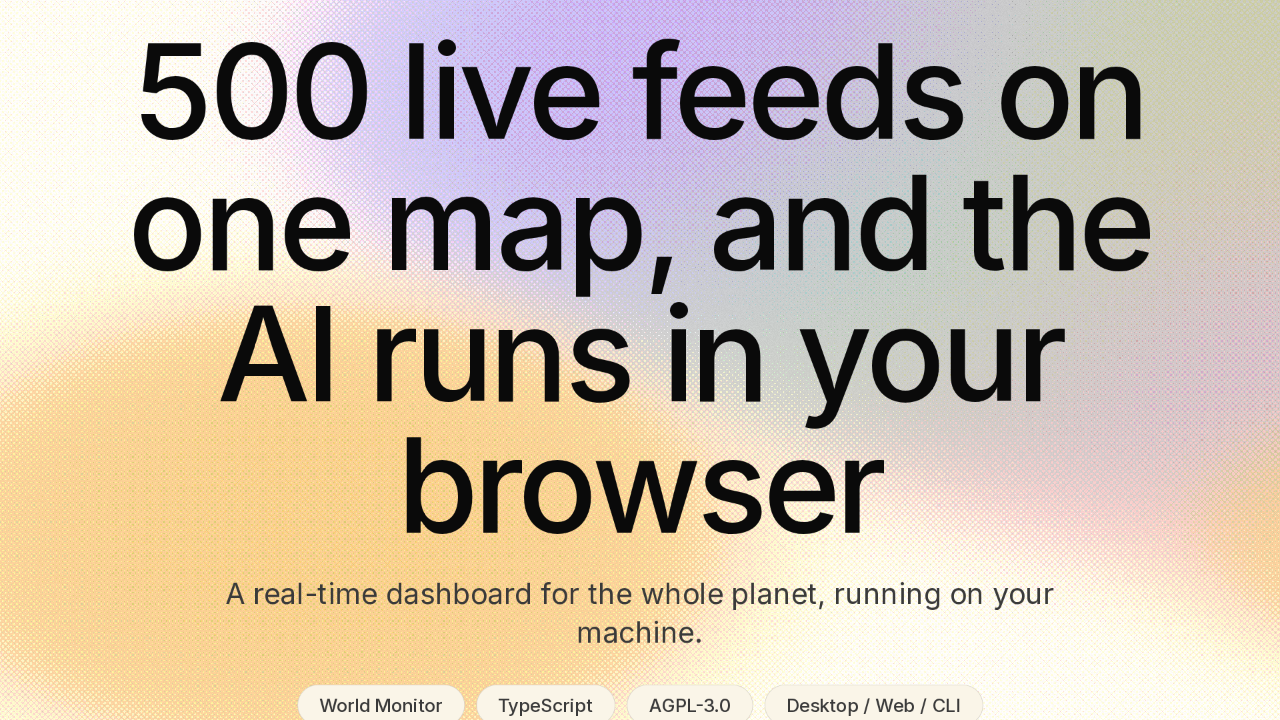
500 live feeds on one map, and the AI runs in your browser
Every minute, the world throws off more news, more market moves, more alerts than anyone can follow. World Monitor pulls all of it onto one map. It's an open-source dashboard that watches the whole planet in real time. And the whole thing runs on your own machine.
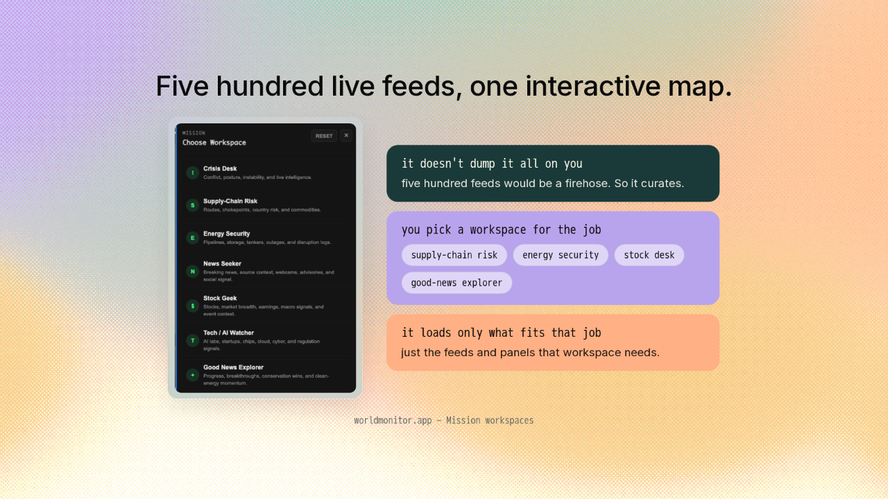
Five hundred live feeds, one interactive map.
World Monitor gathers more than five hundred live feeds onto one interactive map. It doesn't dump all of it on you at once. You pick a workspace for the job in front of you, like supply-chain risk, energy security, a stock desk, or a good-news explorer. Each one loads just the feeds and panels that fit that job.
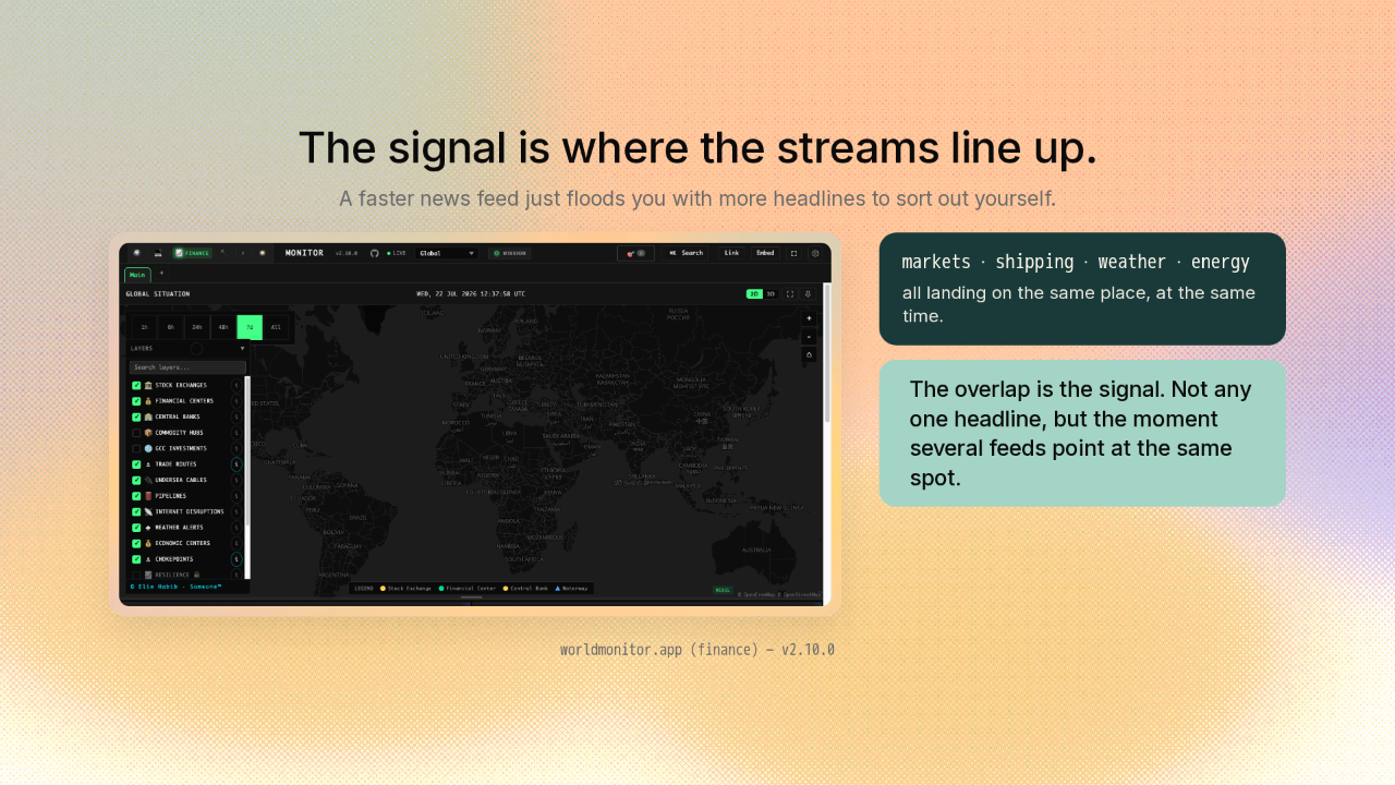
The signal is where the streams line up.
A faster news feed doesn't help. It just floods you with more headlines to sort out yourself. World Monitor's answer is to put the streams on a map and watch where they line up. Markets, shipping, weather, energy, all landing on the same place at the same time. That overlap is the signal. Not any one headline, but the moment several feeds point at the same spot.
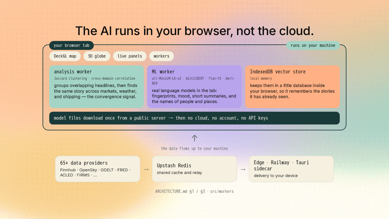
The AI runs in your browser, not the cloud.
Here's the part you'd never guess. A dashboard this smart looks like it must be calling some big AI in the cloud. It isn't. The AI runs right in your browser tab. Two little engines do the work. The first reads every headline and groups the ones that overlap, using a plain word-overlap score. Then it looks across those groups for the same story showing up in markets, in weather, in shipping. That's the correlation engine. It's what turns hundreds of separate feeds into one convergence signal. The second engine runs real language models, right there in the tab. A small one turns each headline into a fingerprint it can compare. Others read the mood, write short summaries, and pull out the names of people and places. It keeps them in a little database inside your browser, so it remembers the stories it's already seen. The model files download once from a public server, then everything runs on your machine. No cloud, no account, no API keys. That's the whole pitch, and it isn't marketing. It's where the code runs.
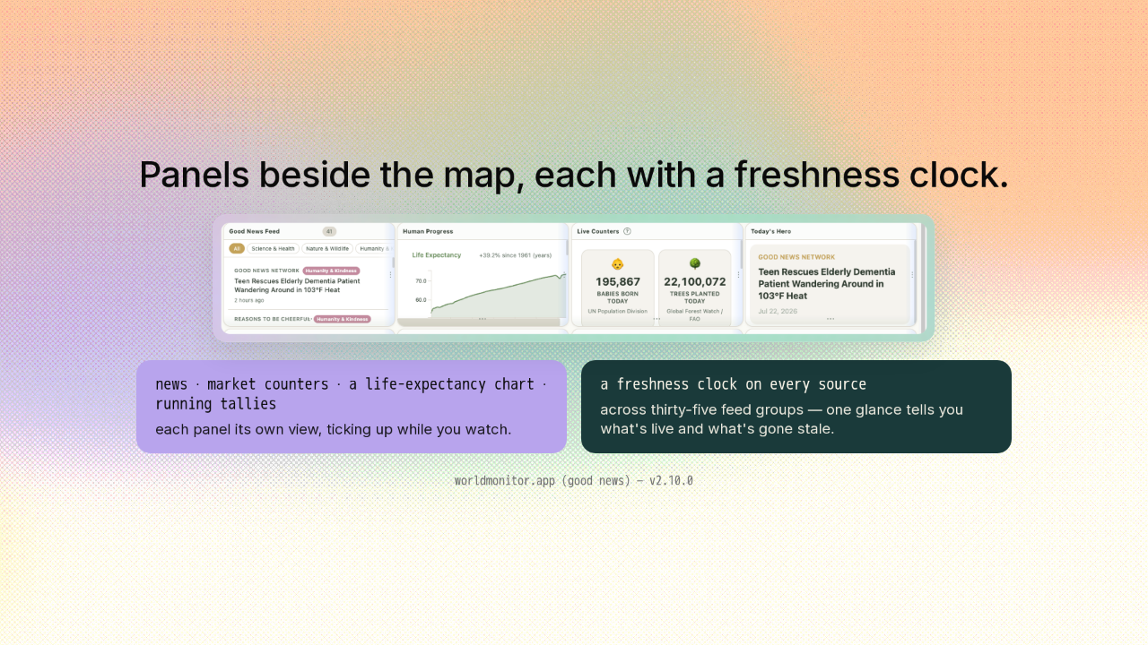
Panels beside the map, each with a freshness clock.
Alongside the map sits a grid of live panels, each one its own view. News, market counters, a life-expectancy chart, running tallies that tick up while you watch. And every source carries a freshness clock, across thirty-five feed groups. One glance tells you which streams are live, and which have gone stale.
One codebase, every surface.
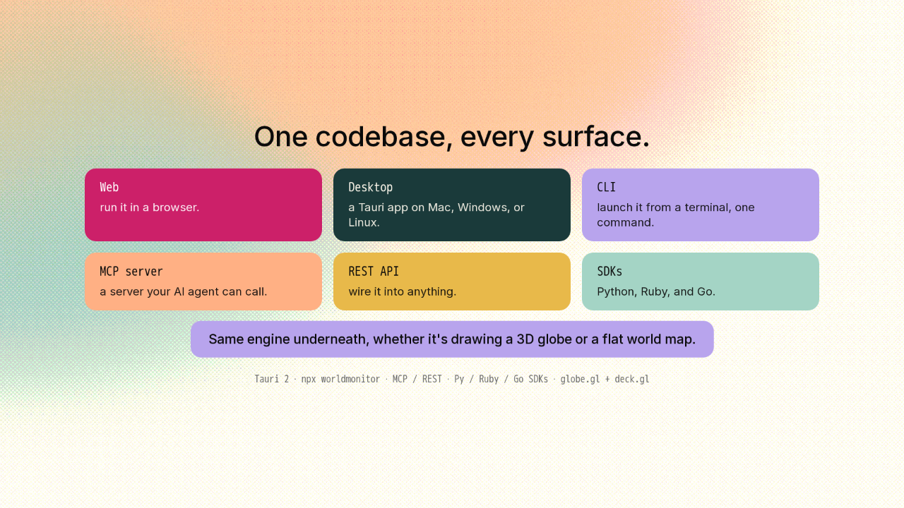
Here's the engineering choice that stands out. All of it comes from one codebase, and it ships everywhere. Run it in a browser. Install it as a desktop app on Mac, Windows, or Linux. Launch it from a terminal with one command. There's a server your AI agent can call, plus SDKs for Python, Ruby, and Go. Same engine underneath, whether it's drawing a 3D globe or a flat world map.
Get it.
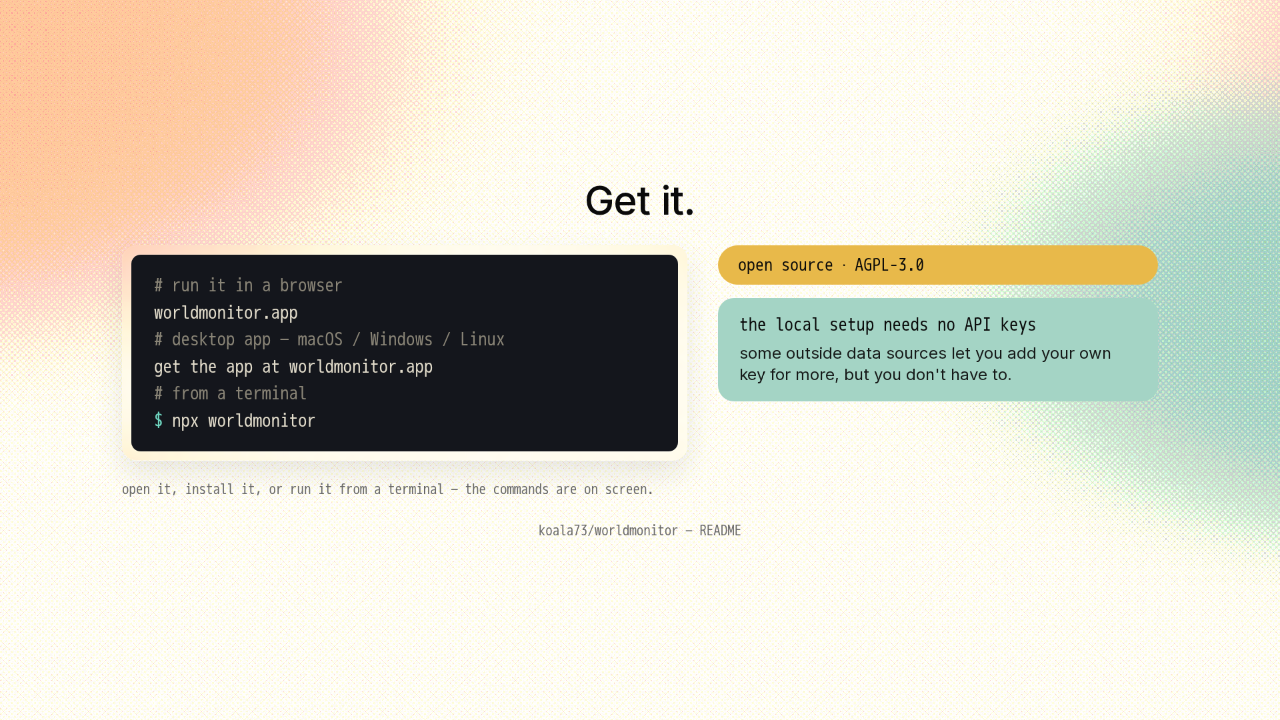
# run it in a browser
worldmonitor.app
# desktop app — macOS / Windows / Linux
get the app at worldmonitor.app
# from a terminal
$ npx worldmonitor
It's open source, under the AGPL license. Open it in a browser, install the desktop app, or run it from a terminal. The commands are on screen. The local setup needs no API keys at all. Some of the outside data sources let you add your own key for more, but you don't have to.
The whole world's signal, correlated on your machine.

So that's World Monitor. The whole world's signal on one map, and the AI that connects the dots runs on your own machine. It's open source, and the link is on screen. New repo tomorrow.